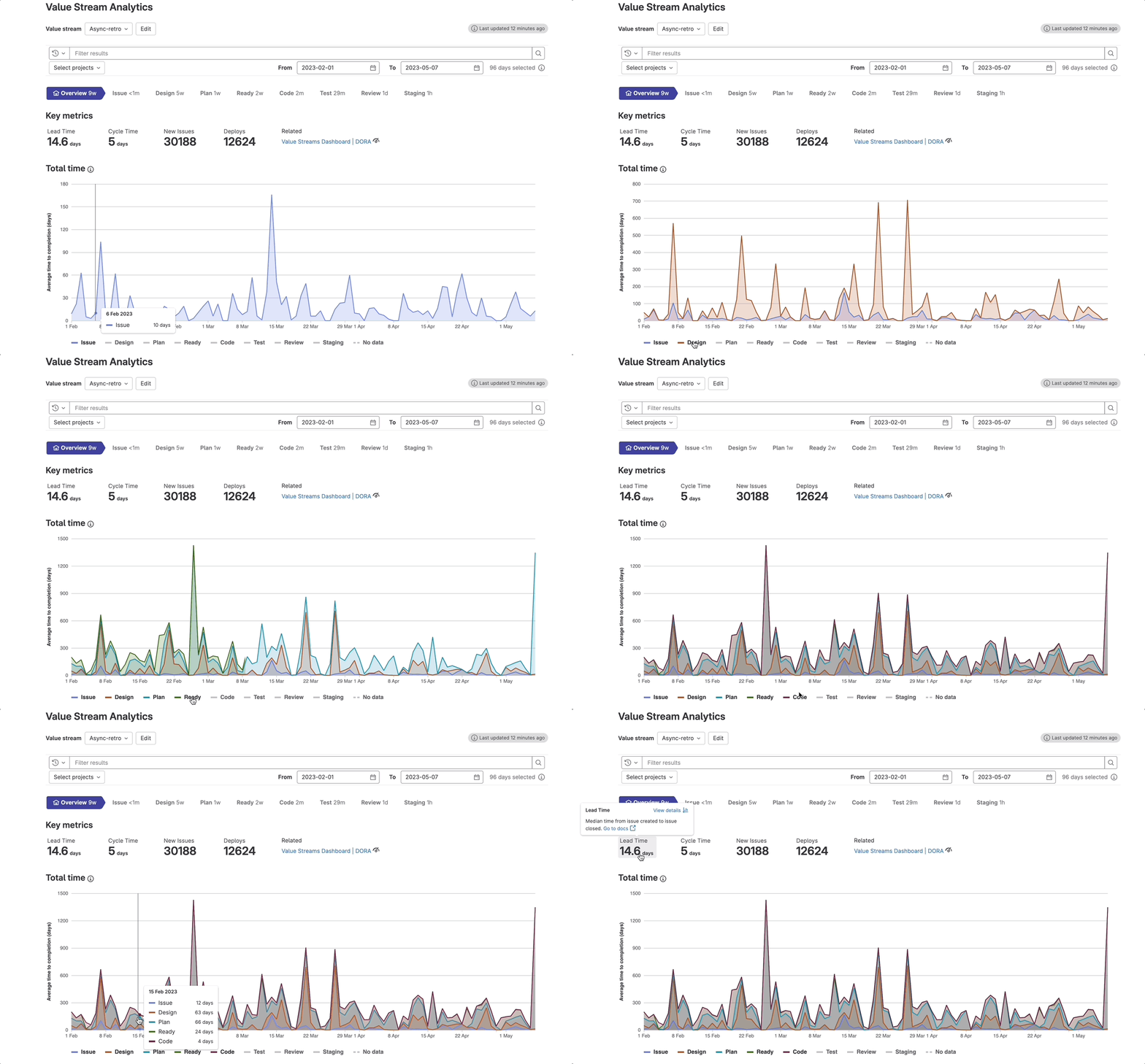
Understanding where time is spent during the development lifecycle is a crucial insight for software leaders when optimizing the value delivery to customers. Our new Value Stream Analytics Total Time Chart is a visualization that helps managers uncover how long it actually takes to complete the development process from idea to production. Managers also can learn how much time teams spend in each stage of the workflow.
 Value Stream Analytics Total Time Chart
Value Stream Analytics is available out of the box in the GitLab platform. It surfaces the process and value delivery metrics through the unified data model that stores all the records around development efforts. Value Stream Analytics uses a backend process to collect and aggregate stage-level data into three core objects:
- Value streams - container objects with stage list
- Value stream stage - an event pair of start and end events
- Value stream stage events - the smallest building blocks of the value stream. For example, from Issue created to Issue first added to board. See the list of available stage events.
Register for the GitLab 16 webinar, where we will unveil the latest innovations in our AI-powered DevSecOps platform.
We added in the new chart the stages breakdown as a stacked area chart to make it easier to understand how each stage contributes to the total time, and how that changes over time. Each area in the chart represents a stage. By comparing the heights of each area, you can get an idea about how each stage contributes to the total time of the value stream. We also added a tool tip with the stages breakdown sorted top to bottom, to help you understand the stages in their correct order.
The new chart is available in the Value Stream Analytics Overview page (on the left sidebar, select Analytics > Value stream). This page includes four sections:
- Data filter text box - on the top of the Overview page you can use the Data filters to view data that matches specific criteria or date range.
- Stage navigation bar - below the filter text box you can use the the stage navigation bar to investigate what happened in the specific stage and to identify the items (issues/MRs) that are slowing down the stage time.
- Key metrics tiles - the summary of the stream performance is displayed, above the chart in the Key metrics tiles.
- Overview charts - the newly added Total Time Chart and the Task by type chart.
But that's not all. The Total Time Chart also simplifies the top-down optimization flow, starting from the Value Streams Dashboard organization-level view to a drill-down into the performance of each project:
From the Value Stream Analytics overview page, you can drill down from Key metrics tiles into other GitLab analytics pages for deeper investigations. You can also go up to the Value Streams Dashboard, or investigate the DORA metrics that are also available in the new dashboard.
It's important to note that the chart data is limited to items completed within the selected date range. Also, there could be points in time with no "stage event" actions. In these cases, the chart will display a dashed line to represent the missing data. These gaps can add contextual information about the workstream, and usually do not represent interruptions in the data. When there is "no data" for a specific stage, the stage line will be flat.
To learn more check out the Value Stream Analytics documentation.
With the Value Stream Analytics Total Time Chart, you get immediate insights about the time spent in each stage over time to determine if progress is being made. Try it out today and see the difference it can make in your workstream!


