This is part two of our multipart series introducing you to the capabilities within GitLab Value Stream Management and the Value Streams Dashboard. In part one, learn about the Total Time Chart and how to simplify top-down optimization flow with Value Stream Management.
Getting started with GitLab Value Streams Dashboard, a customizable dashboard that enables decision-makers to identify trends, patterns, and opportunities for digital transformation improvements, is easy. If you're already using GitLab Value Stream Management, simply navigate to your project's or group's Analytics tab, and within Value stream analytics, click on the "Value Streams Dashboard - DORA" link. This will open a new page with the Value Streams Dashboard.
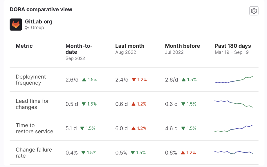
 DORA metrics comparison panel
GitLab Value Stream Management allows customers to visualize their end-to-end DevSecOps workstreams, manage their software development processes, and gain insight into how digital transformation and technological investments are delivering value and driving business results. GitLab Value Stream Management is able to do this because GitLab provides an entire DevOps platform as a single application and, therefore, holds all the data needed to provide end-to-end visibility throughout the entire software development lifecycle. So now your decisions rely on actual data rather than blind estimation or gut feelings. Additionally, because GitLab is the place where work happens, GitLab Value Stream Management insights are also actionable, allowing your users to move from "understanding" to "fixing" at any time, from within their workflow and without losing context.
The centralized UI in Value Streams Dashboard acts as the single source of truth (SSOT), where all stakeholders can access and view the same set of metrics that are relevant to the organization. The SSOT views ensure consistency, eliminate discrepancies, and provide a reliable and unified source of data for decision-making and analysis.
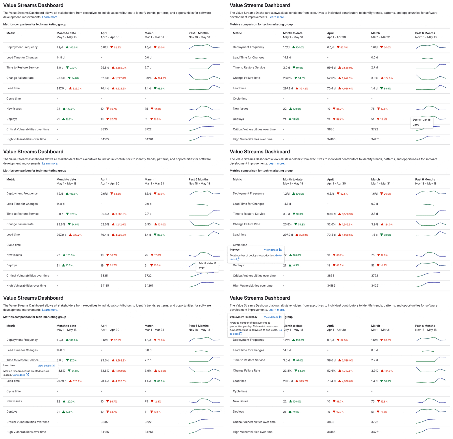
The first iteration of the GitLab Value Streams Dashboard was focused on enabling teams to continuously improve software delivery workflows by benchmarking value stream lifecycle metrics, DORA metrics, and vulnerabilities metrics. One of the key features is a new DevSecOps metrics comparison panel that displays the metrics for a group or project in the month-to-date, last month, the month before, and the past 180 days.
This comparison enables managers to track team improvements in the context of the other DevSecOps metrics to find patterns or trends over time. The data is presented in a clear and concise manner, ensuring that you can quickly grasp the significance of the metrics.
 Value Streams Dashboard metrics comparison panel
Additionally, from each metric you can drill down to a detailed report to investigate the underlying data, understand what is affecting the team performance, and identify actionable insights.
We understand that every organization has its own set of subgroups and projects, each with specific processes and terminology. That's why we designed our dashboard to be flexible and adaptable. Users have the power to customize their dashboard by including panels from different subgroups or projects.
Tracking and comparing these metrics over a period of time helps teams catch downward trends early, drill down into individual projects/metrics, take remedial actions to maintain their software delivery performance, and track progress of their innovation investments. Value Streams Dashboard's intuitive interface reduces the learning curve and eliminates the need for extensive training. Everyone can now immediately leverage the platform's unified data store power, maximizing their productivity and saving precious time and resources.
Value Streams Dashboard roadmap
We are just getting started with delivering new capabilities in our Value Streams Dashboard. The roadmap includes planned features and functionality that will continue to improve decision-making and operational efficiencies.
Some of the capabilities we plan to focus on next include:
- adding an executive-level summary of key metrics related to software performance and flow of value across the organization
- adding a "DORA Performers score" panel with the DORA metrics health from all the organization's groups and projects
- adding filter by label to the comparison panel - we recognize that every team does not follow the same flow so we are adding them to slice and dice the dashboard views with GitLab labels as filters
To help us improve the Value Stream Management Dashboard, please share feedback about your experience in this survey.
Learn more
-
Find out what's next on the Value Stream Management direction page.
-
Learn how to use the new dashboard using the Value Streams Dashboard documentation.
-
Watch this short video on Value Streams Dashboards:
Check out part three of this multipart series: "GitLab's 3 steps to optimizing software value streams".
Disclaimer: This blog contains information related to upcoming products, features, and functionality. It is important to note that the information in this blog post is for informational purposes only. Please do not rely on this information for purchasing or planning purposes. As with all projects, the items mentioned in this blog and linked pages are subject to change or delay. The development, release, and timing of any products, features, or functionality remain at the sole discretion of GitLab.


